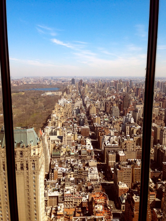
A few weeks back, Adrian sent me uptown to the GM Building for a feature on Jeff Kolitch, the manager of Baron Capital’s Real Estate Fund. Since the focus of the article was Real Estate, they kinda wanted to see Real Estate, so on the scout, even thought they had a lot of fish tanks that might make for some fun portraits…
…I still had to make sure to come up with something that might actually relate to why Jeff was being interviewed…
Adrian really liked the window and its view, so Ben and I figured we could turn it into a ‘frame’ that would hold our photo…
And the final images…
But we weren’t done yet. When Jeff walked me around the offices on the location scout, I really liked the space-age, floating glass staircase that joined the 48th & 49th floors…
…and after a bit of lighting…
…we ended up with this…
Sharp eyes will notice that in the final image I cloned the wall on the right side of the photo onto the left side to make things more symmetrical, a technique I used once before on another staircase shot for Businessweek.


thanks for that post. always interesting.
did the use of the color checker shift the color of the sky back to blue from magenta?
i wonder, as the trees initially were green and after the fix the got brownish.. were they brownish originally?
(it’s just a curiosity questions, not trying to be a smarty pant).
i like the lighting on the stairs, could i ask where they were placed?
thank you and good to have you back
I use the MacBeth card primarily to see how all colors will shift if I start messing around with Selective Color in post. But that magenta cast in the raw images was more of a white balance issue than anything else. When I processed my TIFFs, the sky was pretty clean, but I did pop it up by removing yellow in both the Cyan and Blue channels in Selective Color. As for the trees…I hadn’t thought about that, but it probably had something to do with me adding red to the shadows in Color Balance.
On the stairs, we clamped four Profoto Acute heads with Super Clamps to the hand rails of the staircase. The heads were aimed straight down and just had regular 7″ reflectors with Full CTB filters on them to ‘Blue Up’ the look. The front light was simply one 3′ Creative Light mini-octa, no front screen, but with the grid louvers in place to focus the light just on him and keep it kinda contrasty. BT
This has been a fantastic post. Sharing your ideas and nice performance of your pictures is a pleasure for me!!!
Thnks again!!!
your pretty good. pretty pretty pretty good.
good to have you back!
Hi Brad! How did you manage to avoid reflections on the window? Looks like to had your modifier off to the right. Love the stair shot as well. Glad you are back!
The window shot was actually pretty easy to light. We just used the same 3′ Creative Light mini-octa/no front diffusion screen/grid louvers that we used on the stairs shot. Because of the grid louvers it is very directional, and it makes it possible to back it of far enough to get rid of the reflection in the window. BT